REBEKAH WARNER
art direction & design


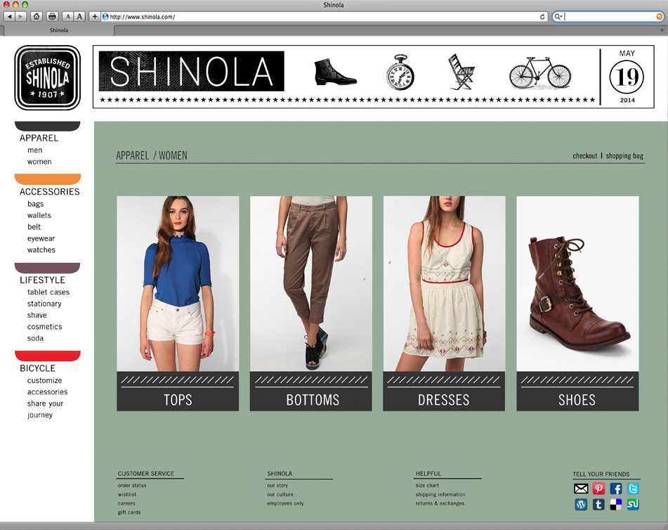


Shinola
Identity / style guide, A4 (8.3”x11.7”) / brand systemTeam members: Stephanie Fleischer, Ryan Rifenberg, Megan Klemz
The goal of the Shinola book is to establish a new system for the brand first developed in the early 1900s; one that appeals to a modern audience that appreciates well-crafted goods and a vintage feel. Pulling inspiration from the industrial history of the brand’s new home in Detroit, the font Shinola was developed using metal stamps from a workshop. Labels on machines and the youth and spirit of modern day Detroit largely influenced the typography system and color palette that was developed. This book tells the brand’s story and points it towards the future. As team leader for the group, this project honed skills of organization and research, as well as communication and collaboration.